Back in the day - i wanted to do a little appropriation and recontextualization thing. I wanted to make a short film with Andy Warhol's series of portraits. I wanted to use Mao Zedong series and Marilyn Monroe series.
The plan was to combine both series in a something of a narrative. The sequence would be one Mao portrait and Marilyn portrait. The changes of coloring will proppel the narrative and provide something of a progression.
Here's a proof of concept i've made back in 2015
неділя, 30 грудня 2018 р.
субота, 29 грудня 2018 р.
MFT: Matthew Plummer Fernandez - Every Mickey Mouse 3d model found online merged into one object

This is Mickey Mouse as seen by Matthem Plummer Fernandez. He made it by collecting every single one 3D model of Mickey Mouse that he could find online. Then he merged them into one object. And it is glorious.
вівторок, 18 грудня 2018 р.

понеділок, 17 грудня 2018 р.
James E. Alcock - Tips for better critical thinking
I was going through Skeptical Inquirer recently. This magazine is one of my favorites. It is all about blasting something out of its foundation. With that gleeful cackle that the demolition workers don't really do but you expect them to. While reading about all sorts of stuff that is beyond questions, doubts or other kinds uneasy discontent -
The newest issue (November/December 2018) contained Harriet Hall's review of the book "Belief: What it means to believe and why our convictions are so compelling" by James E. Alcock. Judging from the review - it was nice and sweet exploration of the cognitive processes. Then i went and check it out for myself.
It was really good. I finished it in just a couple of hours.
In the final chapter, Alcock gives eight tips on developing and improving your critical thinking skills. I think these are worth sharing:
- Remember that we can all be fooled.
- Be wary of your intuitions.
- Be wary of the Fundamental Attribution Error: attributing people’s behavior to their characters and intentions while overlooking the power of the situation.
- Be wary of validation by personal experience.
- Don’t rely on a single source of information.
- Don’t over-interpret correlations.
- Ask “compared to what?”—a wine was rejected because it was found to contain two million asbestos particles per liter, but the concentration of asbestos particles in the city water supply was higher than that.
- In the face of inadequate evidence, suspend judgment rather than jumping to conclusions
четвер, 22 листопада 2018 р.
MFT: Sesame Street - Big Bird - ABC-DEFGHI-JKLMNO-PQR-STUVW-XYZ
The original Sesame Street was jam-packed with an inventive stuff from top to bottom. It was daring, boundary pushing entity in so many ways. Sure, it was a children's program, but that was what let it to run away with so many subversive aesthetic concepts. The sketches were always two-fold. There was one simple thing on the surface and the other much more complex right underneath it. This wasn't always intentional - but it there was always more than just a setup and a punchline in every sketch. Case in point - this sketch.
This is a sketch from Sesame Street Season _ episode _. It features Big Bird as an overzealous student who just learned how to read. However, he is yet to comprehend the meaning of what he is reading. Because of that he comically misses the meaning of an Alphabet written on a fence and reads it as if it was one big word. You can't blame him - an alphabet sequence can be pronounced as a single word, there is just no point in doing that.
And so Big Bird was very happy (let's call it "profoundly satisfied") that he managed to read and memorize such a big word and so he was eager to share his progress with Lisa. And in return she points out that he was doing it wrong - it was an alphabet all along not a big word. It was a heartbreaking moment for Big Bird - he tried so hard and yet he missed the point and did it wrong. The drama lasted a moment more or so and since this is a children's program the resolution was a compromise. That thing was an alphabet and Big Bird was spelling it wrong but he made up his own way of pronouncing an alphabet and it got the right to exists too, because why not?
This sketch is a neat showcase of the flexibility of language. Within a simple setup it shows you what the language is all about. There are rules that exists to keep it accessible to the others, but there is also an incentive to try it differently - intentionally or not. After all - why bother if it all can be only one way - even a mistake can lead to something unexpected and inspired.
середа, 21 листопада 2018 р.
Having Fun with OCR: Owls are not what they seem edition
Sometime Optical Character Recognition can uncover something really unexpected in the text that is actually quite comprehesible.
This is the case with this caption:

Here we have an entire sheet of with the word "Zoop!". In case if you don't know, "Zoop!" is an onomatopoeaic exclamation accompanied by finger guns that originated on Reddit a couple of years ago. The story goes - it came out of tired frustration. But in essence, it is eerie nondescript.
Know your meme got the caption you can see above and given its repetitive nature - it is perfect cannon fodder for some blatant conceptual experimentation. Naturally, i've put this image through OCR engine.
Here's what came out of it:
fiQfiEwo@oEwfi©fiEWfi©fiEwfi©fihwo@fiEWfi©fihw
a©aEWfi©fiEwa©amwfi©fihw¢©amwfi©fimwa©amw
fi©fihw¢©amwfi©fih®fi©fih®fi©fimwa©amwfi©fimw
fi©fiEWQ©fiEWfi©oEWfi©fiEWo©oEWfi©fihwo©fihw
fi©fihwa@fihwfi©fifiwa©fihwfi©fihwo©oEWfi©fihw
G©oEWfi©fiEWoQoEWfiQfiEWfi©fiEwfi©fiEWfi@fiEW
fi©fihw¢©amwfi©fih®fi©fih®fi©fimwa©ahwfi©fimw
a©5EWfi©fibwa©fimwfi©fimwa©amwfi©fihwa©ahw
fiQfiEwo@oEwfi©fiEWfi©fiEwfi©fihwo@fiEWfi©fihw
a©aEWfi©fimwa©amwfi©fihwa©amwfi©fimw
It turns out that underneath that completely innocent and absolutely pointless image was hidden this wicked incantation. I find it debilitatingly charming.
But that's not all. When I turned the image in 180 degrees - i've got this:
doon-@Q-
doon-@Q- doozfl©odooz$©$ doozfl©5dooz$®$ doozD©Ddoon~©Q~
doon©odoon©Q doozD©odoon©Q doon©odoon©Q doozfl©LI
doon-@Q~ doozfl©odooz$©§l doozD©Ddoon©Q~ doozD©9doon~©Q~
doon©odoon©Q doozD©odoon~®Q~ doon@-Ddoon-@Q-
doon-@Rl~ doon©Odoon~©Q doozfl©5dooz$©¢ doozfl©odooz$©¢
doon©Odoon©Q doozD©5doon©Q doon©odoon©Q doozfl©§I
doon©Q doozfl©odooz¢©§l doozD©Ddoon©Q~ doozfl©9dooz$©¢
doozD©odoon©Q doozD©odoon~©Q~ doozg@odoon-@Q-
doon-@Rl~ doozfl©odooz$©$ doozfl©5dooz$®$ doozD©Ddoon~©Q~
doon©odoon©Q doozD©odoon©Q doon©odoon©Q doozfl©LI
doon-@Q~ doozfl©odooz$©§l doozD©Ddoon©Q~ doozD©9doon~©Q~
doon©odoon©Q
This is even more disturbing. It reminds me of Tibetan monks chants as heard on KLF's Chillout.
But that's not all. After getting another fix of OCR discovery - i've used another OCR engine and this time - i've got this:
Q.Q.Q.Q.Q.Q.Q.Q.Q.Q.CLQ.Q.Q.Q.Q.Q.Q.CLQ.Q.Q.Q.Q.Q.
OOOOOOOOOOOOOOOOOOOOOOOOO
ooooooooooooooooooooooooo
NNNNNNNNNNNNNNNNNNNNNNNNN
©©©©©©©©©©©©©©©©©©©©©©©©©
CL^CL^CL^CL^CL^-Cl^CL^-Cl
CL ^ CL ^ Q ^ CL
CL
©©©©©©©©©©©©©©©©©©©©©©©©©©
ClClClClCLClCLClCLClClClCLClCLClCLClClClCLClCLClCLCL
oooooooooooooooooooooooooo
oooooooooooooooooooooooooo
NNNNNNNNNNNNNNNNNNNNNNNNNN
©©©©©©©©©©©©©©©©©©©©©©©©©©
CL
CL
CL
CL
CL
CL
CL
CL
CL
CL
K "8 "8 „
N m N m N m N
N
ClClClClClClClClClClClClClClClClClClClClClClClClClCl
OOOOOOOOOOOOOOOOOOOOOOOOOO
oooooooooooooooooooooooooo
NNNNNNNNNNNNNNNNNNNNNNNNNN
©©©©©©©©©©©©©©©©©©©©©©©©©©
CL ^ CL
CL
CL
CL ^ CL
CL
CL
Cl a Cl
CL
CL
CL
Kl N N Kl Kl Kl INI Kl Kl Kl Kl Kl Kl Kl
N
N
N
N
N
N
N
N
N
N
N
N
CLClCLClCLCLCLClCLClCLClCLCLCLClCLClCLClCLCLCLClCLCl
oooooooooooooooooooooooooo
oooooooooooooooooooooooooo
NNNNNNNNNNNNNNNNNNNNNNNNNN
©©©©©©©©©©©©©©©©©©©©©©©©©©
Now this is some serious concrete poetry.
понеділок, 19 листопада 2018 р.
Bullshit: Bad Product Name AKA Kleptomania Features
Getting the name of your product right is one of the hardest things ever. No wonder - it is the first thing that turns up and it should make the impression.
But there is always some kind of a challenge in the mix.
Sometimes the name is descriptive but not really expressive. Other times it doesn't really transmit what the product is about. Then there are times when the name of the product is just there. And then there are times when the name is so out there it doesn't really work the way it was supposed to and instead causes acute bout of cognitive dissonance.
Case in point - Kleptomania.
What it is? It is a tool to convert screen images to text with OCR algorithms. It is called that way because it enables OCR's anything in a manner of screensnapping tool. Theoretically, the name like this makes sense but not exactly. Because the word "kleptomania" refers to "inability to refrain from the urge for stealing items" which is not exactly what this application is about.
While the app itself is fine, its name is just so off, it is unintentionally funny.
There is list of features on the product page and it looks like this:

The list of feature is representative. It gives you more or less complete understanding of what this thing is capable of.
However, taken outside of context - the name of the product in the heading creates unintentional cognitive dissonance. Really hard and punishing cognitive dissonance. Because it says "Kleptomania features" and when you read "Kleptomania features" you think about "inability to refrain from the urge for stealing items" and not "OCR Screensnap Tool". The combination of the list and the title creates weird piece of conceptual writing.
пʼятниця, 16 листопада 2018 р.
MFT: Wish You Were Here - Tell Me all the Swear Words you know scene (featuring Heathcote Williams)
This is a short scene from 1987 British quirky romantic melodrama "Wish you were here". It features _ as Lynda, the lead character of the film and Heathcote Williams as her psychiatrist.
The story goes Lynda went a little bit mental and acted quite a bit beyond the boundaries of decency. She showed her stockings, suspenders and knickers to everybody. Because of that she was sent for evaluation by the psychiatrist played by one and only Heathcote Williams, who somehow manages to chew scenery while retaining stone cold demeanor. The way he hams it up is simply impressive.
The scene starts with the psychiatrist attempting to determine what kind of help Lynda needs. In order to do that, he asks Lynda to go through the alphabet and recite all the swear words she knows. Lynda is a bit confused by the proposed exercise but is onboard with this kind of exercise and happily engages in the act.
The thing starts with "A" and "ass". Heathcote tries to confuse her by accentuating on the ridiculuousness of the situation, but Lynda is undeterred. There is nice back and forth with "ass...hole".
Then, on the later "B" Lynda blasts the whole barrage of words - "bloody bastard bugger bum". But she missed "balls" and points that out and Heathcote retorts with "so we did, nevermind".
Then, on the letter "C" she finally stumbles. She wants to say "cock" or "cunt" but stops herself, says she can't think of nothing. Heathcote asks her to say "something really filthy". Instead she delivers "caca" while increasingly annoyed Heathcote catches her on that.
The next letter "D" rolls on smoothly with "damn". The letter is "E" is omitted due to the fact that there are no swear words starting with "E". Lynda tries to argue that but decides to go on.
When Heathcote transitions to letter "F" he suggests Lynda to use the "dirty, smutty" word everyone knows while Lynda tries to play stupid and says she doesn't know what he is talking about. Heathcote is trying to get it out of her while she denies she knows it. When he bluntly states that he wants to hear he saying that words, Lynda cuts him off with "dirty old bugger".
Heathcote gives up and goes away. I guess this is going to be a long day.
четвер, 15 листопада 2018 р.
Heathcote Williams reads his poem 'Advertisement' in 1980
Today is Heathcote Williams' birthday. Happy Birthday, Heathcote! You are sorely missed. Let's celebrate this great man by watching him reading one of his poems.
Heathcote Williams is my favorite poet. There was just something that i could really identify with in his writings. The way he explored themes, the verbiage he used, the way he managed to make everything feel big and engrossing...
Here's the video of him reading the poem "Advertisement" from 1980. Heathcote reads this poem in a way that makes it the coolest thing in the world.
Part of the reason why this performance is so cool is because of delivery. Heathcote avoids that damned "poet's voice" and just reads the stuff in a semi-casual, deadpan dramatic manner. And it leaves lasting impression. There is this thousand mile chill in his voice. The way he slightly slides between the tones is nothing short of astounding.
There is not much happening on the screen. Heathcote just sits on a chair and reads the poem. Sometimes he looks at the camera, then his eyes move back to the sheet of paper with the text. Slowly but surely, the camera moves towards him. You can see his hands trembling a little, you start to see the details of his face. The camera gets closer and closer until it is a close-up. Heathcote stops reading and for a moment or so gives a piercing chilling glance straight into the camera.
субота, 10 листопада 2018 р.
MFT: Hulk Hogan vs Randy Savage - Breathing Match
Here's a little video that shows how transformation and recontextualization makes the case for a new concept forged out of an old thing in a completely unintentional manner. The video depicts a bizarre sighting - two acclaimed professional wrestlers Hulk Hogan and Randy Savage doing nothing but intensely breathing. Why? Because this video is an edit of a the pair of back to back promos following the break-up of their tag team Mega Powers prior to the feud culmination at Wrestlemania V in 1989.
In the end - it is fair to say that Randy Savage had decisively outbreahed Hulk Hogan in a recontextualized promo standoff. Even though it doesn't really mean a thing - it is a feel good moment for whatever reason nevertheless (maybe because Hulk Hogan kinda sucks). Sure, if this thing was edited as back and forth - it would have been much more effective showcase. But even like that it is enough to establish the concept.
With all the words edited out - this segment is a completely different thing. While the video is loving mocking overly exaggerated promo delivery that was a dominant aesthetic of WWF in the late 80s - it also unintentionally presents a novel concept - a breathing match. The one where competitors should outbreath each other. And the more i think about it - the more i like it.
Just imagine how it might work - you have to outbreath your opponent. How to do it? What is counted as outbreathing? Probably, it depends on who is judging or physical condition of the opponent over the course of the match. Or stumbles and stutters in the breathing bouts. Either way - this video is one of those magical moments when the bliss of nonsense sparks excitement.
пʼятниця, 9 листопада 2018 р.
MFT: Celebrating MindVox ASCII Banner
Of all the things you can find on the internet - bizarre promotional typographic constructions are among the ones that also always manage to occupy a special place in my heart even though there is nothing special about them even if you lower your standards of specialness low enough for them to qualify.
The reason for that is simple - they are easy to play with through various text manipulation and transformation applications. That's the thing with ASCII stuff - it is fun to mess with.
Case in point - MindVox ASCII Banner. The startup was founded in late 1991 by two former members of Legion of Doom hacker group - Bruce Fancher AKA Dead Lord and Patrick Kroupa AKA Lord Digital. It was an Internet Service Provider of a new kind - the one free of corporate shenanigans (something that is becoming increasingly timely right now when the notion that corporations and their grip on the internet is detrimental to the very essence of the world wide web became obvious even to the most casual users). By the mid-90's the service was shut down, probably because it was way ahead of its time and there was not enough momentum to sustain it on a proper level.
Nevertheless, their legacy lives on. And they left a fancy banner for me to screw with. While it is not really a piece of sophisticated artistry, there is a weird charm to this logo, the way the characters are arranged and formatted.
Takes a look:
/\_-\
<((_))>
\- \/
/\_-\(:::::::::)/\_-\
<((_)) MindVox ((_))>
\- \/(:::::::::)\- \/
/\_-\
<((_))>
\- \/
The reason for that is simple - they are easy to play with through various text manipulation and transformation applications. That's the thing with ASCII stuff - it is fun to mess with.
Case in point - MindVox ASCII Banner. The startup was founded in late 1991 by two former members of Legion of Doom hacker group - Bruce Fancher AKA Dead Lord and Patrick Kroupa AKA Lord Digital. It was an Internet Service Provider of a new kind - the one free of corporate shenanigans (something that is becoming increasingly timely right now when the notion that corporations and their grip on the internet is detrimental to the very essence of the world wide web became obvious even to the most casual users). By the mid-90's the service was shut down, probably because it was way ahead of its time and there was not enough momentum to sustain it on a proper level.
Nevertheless, their legacy lives on. And they left a fancy banner for me to screw with. While it is not really a piece of sophisticated artistry, there is a weird charm to this logo, the way the characters are arranged and formatted.
/\_-\
<((_))>
\- \/
/\_-\(:::::::::)/\_-\
<((_)) MindVox ((_))>
\- \/(:::::::::)\- \/
/\_-\
<((_))>
\- \/
There are slashes left and right, underscores, dashes, dashes, dashes, colons, colons, colons, brackers, less-than sign, more-than sign and the name of the company "MindVox" right in the middle of all this. Also - the whole thing is manually centered to compose an image. There are whole lotta spaces involved in this unthankful operation.
While you play with those things long enough (and you do because it is rather time consuming exercise in wasting time) - after a while (a long-long while) you can get some really unexpected things out of it. You can even get some sweet conceptual poetry out of it, if you waste your time hard enough. But it is fun to mess with it just for the sake of it.
четвер, 8 листопада 2018 р.
BSPH: The Beatles + Clint Ruin and Lydia Lunch - Why don't we do it in the road
"Why don't we do it in the road" is the song by The Beatles. It was released in 1968 on the band's double album known as "The White Album". The song was written by Paul MacCartney in a bout of inspiration so perplexing it is fascinating. The story of inciting accident goes like this: while vacating in India MacCartney saw two monkeys having a moment of raw passion for a blink or so and then he thought a good idea to wrap this moment into a song but in an abstract manner. You have to respect him for being able to do that much with so little.
This song is so sparse and vacuous - you can't really do much with it perception-wise. You have to take for what it is - a short, barebone arranged and very simple piece based on a blues formula. In a way, it is a tour de force in being as lame as it is humanly possible in the format of a song.
You can also pretend to think about it for a long time with no closure whatsoever. After a while you can almost reconstruct the train of thought that lead to the creation of this song. I guess, it was just a daring spark of "what if" that erupted out of longing for the sheer sting of amusement. Nevertheless, it is charming
"Why don't we do it in the road" is what can be described as a throwaway. And by late 60s The Beatles and Lennon / MacCartney in particular had mastered the subtle art of throwaway to perfection. The song is a showcase of how you can do a song basically out of anything at hand - spoilers: you just do it (i feel Pink Fairies vibes).
In fact, it is not even a song, there is just this jingle "Why don't we do it in the road" and some transitional ramblings to spice it up. The lyrics are unintentional exercise in constraint. There are only two lines - "Why don't we do it in the road" over and over again and "No one will be watching us" once in a while because apparently it gets boring uttering the same thing over and over again. The lyrics are performed in an increasingly erratic manner. It gets more and more aggressive or agitated and it brings a lot of needless intensity to this little piece. And then it is over.
***
Later, in 1991, JG Thirlwell AKA Clint Ruin and Lydia Lunch had released their interpretation of the song on their collaborative release "Don't Fear the Ripper". Ruin / Lunch version is a good example of how to make a cover version really distinct piece that brings something new to the song.
This cover version was a complete reinvention that put its tongue-in-cheek barely-there sensual subject matter to the forth and upped the tension to the uncomfortable levels. The word that best fits this version is "malevolent".
The changes are drastic but subtle. The song follows the original but turns it upside down at every turn. In addition to the original minimalist lyrics performed by Lunch with an exquisite salaciousness and sheer voluptiousness, there is an additional bout of scatting from Clint Ruin after every verse. It is disturbingly joyful blare of drooling expectation. This is a culmination of something-something and not in a good way.
Ruin / Lunch version drips with sleaze. It is dark and brooding stomp. In this arrangement, it is a tale of raw lusty desire trapped beyond reach and attemting to get out of its restraints by all means necessary. It is a story of passion boiling and slowly going out of control and destroying everything. It goes nowhere with that maniacal thousand yard stare and it is fascinating...
середа, 7 листопада 2018 р.
BSPH: Kraftwerk - Boing Boom Tschak
In continuation of previous post - let's remember the last time someone pulled the audacious trick "Let's spell obviously scat lyrics absolutely straight".
"Boing Boom Tschak" is a composition by legendary german techno-pop band Kraftwerk. It was released in 1986 as an opening track on their abortive comeback album "Electric Cafe". The composition is a part of the Techno-Pop suite that encompasses the entire side A of the album.
And what an album it was. While "Electric Cafe" continued to explore minimalist stilted aesthetic presented on the 1982 album "Computer World" and 1983 single "Tour de France", in the same time it presented something new and completely different for Kraftwerk. If previously Kraftwerk were working out the theme - this time there was no concept to back up the music, it was less about exploring any particular idea and more about just making some bangers.
Or so it seemed.
Also - they've probably heard Art of Noise and Yello, said "What?" a couple of times and thought they should hold their beers. Which was rather fair assessment all things considered.
"Boing Boom Tschak" is built around the blips of samples of onomatopoeiac exclamations reminiscent of sharp percussive sounds. In addition to obvious "Boing", "Boom" and "Tschak", there is also "Peng" and a slew glitched-up, chopped and screwed variations for every word. Every exclamation got their share of "B-b-b-b", "Tsch-tsch-tsch", "Pe-pe-pe", "Boo-boo-boo" and "Bo-bo-boing" fills. In addition to that there is a title drop "Musik Non Stop" which is means so little in the space of this track, it could have been "giraffes on horseback salad" to the same effect.
Despite being reminiscent of drum sounds, the samples blatantly sound like mere words and nothing else which creates dubious dissonance with their meaning. The exclamations are intentionally devoid of any semblance of groove and dried down to their very carcasses. They occur as sparks in the vacuum, surrounded by some sparse sonic wallpaper.
It sounds utterly pointless but in spite of that, the resulting "lyrics" are really inspired example of constrained scat sound poem score designed for as many elaborations as possible but stuck in the routine. It should be noted that the variation part was something that was explored by Yello at that time.
"Boing Boom Tschak" tries really hard to fill as much space as possible with this stuff and in the same time make it feel like every word is launched straight into heart of the abyss. After a while it starts to resemble poker face "try not to laugh" exercise. However, despite all odds, combined together they create some otherworldly Dalek-like groove.
As it is "Boing Boom Tschak" is barely a song, it is more like an extended jingle that just goes on and on and on apparently nowhere but with that boggling tenacity. It is a part of the bigger thing that was torn out and left on its own. The next track "Technopop" just pretends "Boing Boom Tschak" don't exists and does its own thing.
In 1991 it was incorporated into the song "Music Non-Stop" on the 1991 album "The Mix". This time it was much better fit that improved upon both songs which were criminally underdeveloped in their original forms. Now it sounded like a demented Detroit Techno stomp by the way of Moondog.
But as it is, "Boing Boom Tschak" is a weird stilted piece. It is stuck uncertain of what it should be. The best word to describe it will be "pointless" and it is probably the most glorious example of a completely pointless song that nevertheless exists and definitely proud of this fact. But the lyrics are really great scat material worth performing the right way.
"Boing Boom Tschak" is a composition by legendary german techno-pop band Kraftwerk. It was released in 1986 as an opening track on their abortive comeback album "Electric Cafe". The composition is a part of the Techno-Pop suite that encompasses the entire side A of the album.
And what an album it was. While "Electric Cafe" continued to explore minimalist stilted aesthetic presented on the 1982 album "Computer World" and 1983 single "Tour de France", in the same time it presented something new and completely different for Kraftwerk. If previously Kraftwerk were working out the theme - this time there was no concept to back up the music, it was less about exploring any particular idea and more about just making some bangers.
Or so it seemed.
Also - they've probably heard Art of Noise and Yello, said "What?" a couple of times and thought they should hold their beers. Which was rather fair assessment all things considered.
"Boing Boom Tschak" is built around the blips of samples of onomatopoeiac exclamations reminiscent of sharp percussive sounds. In addition to obvious "Boing", "Boom" and "Tschak", there is also "Peng" and a slew glitched-up, chopped and screwed variations for every word. Every exclamation got their share of "B-b-b-b", "Tsch-tsch-tsch", "Pe-pe-pe", "Boo-boo-boo" and "Bo-bo-boing" fills. In addition to that there is a title drop "Musik Non Stop" which is means so little in the space of this track, it could have been "giraffes on horseback salad" to the same effect.
Despite being reminiscent of drum sounds, the samples blatantly sound like mere words and nothing else which creates dubious dissonance with their meaning. The exclamations are intentionally devoid of any semblance of groove and dried down to their very carcasses. They occur as sparks in the vacuum, surrounded by some sparse sonic wallpaper.
It sounds utterly pointless but in spite of that, the resulting "lyrics" are really inspired example of constrained scat sound poem score designed for as many elaborations as possible but stuck in the routine. It should be noted that the variation part was something that was explored by Yello at that time.
As it is "Boing Boom Tschak" is barely a song, it is more like an extended jingle that just goes on and on and on apparently nowhere but with that boggling tenacity. It is a part of the bigger thing that was torn out and left on its own. The next track "Technopop" just pretends "Boing Boom Tschak" don't exists and does its own thing.
But as it is, "Boing Boom Tschak" is a weird stilted piece. It is stuck uncertain of what it should be. The best word to describe it will be "pointless" and it is probably the most glorious example of a completely pointless song that nevertheless exists and definitely proud of this fact. But the lyrics are really great scat material worth performing the right way.
вівторок, 6 листопада 2018 р.
BSPH: The Prodigy - Boom Boom Tap
Sometimes you stumble upon something so simple and astoundingly mind-numbing you just can't help but morbidly wonder how it managed to be the way it is. You realize that by this point you have put more thought in the piece then the actual creators, but nonetheless you soldier on as if it actually mattered.
This is what i thought when i first heard this song.
The song is titled "Boom Boom Tap". It is performed by seminal british big beat electronica producer Liam Howlett AKA one-man band The Prodigy. "Boom Boom Tap" is very simple song, in fact, it is late Black Eyed Peas level of simple. One dig pony. Basically it is what it says on the tin. It is booming, blasting, blaring banger that walks around with a purposeful grimace and a terrible sound.
And indeed, how atrocious does it sound.
It is so loud, you can't really tell what is going on in the song aside from the song playing. It is quite an experience. I think Luigi Russollo would have liked the production of this song. It is so nondescript - it is just impressive.
The loudness of "Boom Boom Tap" is catharthic. It is like a sonic equivalent of Katamari Damacy star substitutes. Mess of sounds so dense - it is nothing in particular but nonetheless imposing and eventually effective.
The production of the song is so uneven - it leaves this weird approximation of impression - as if you haven't really heard the song but some rotting, partially incinerated, partially calcified remnants of the song being blown off by the gust of wind of the incoming tornado. It is just bits and pieces caught in a snapshot and thus turned in the wholesome piece by the act of documenting.
The best thing about this song is the lyrics. While being simplistic and absolutely mind-numbing, the lyrics work really well with the overall sound of the song. It is blatantly charming. These words are really good for crooning and scatting all over the place and also banging head against the wall out of nebulous notion of opaqueness. But in the song they are delivered in the manner so straightforward you start to question the very nature of reality. Why? The reality is that it would have been tongue-in-cheek, if the tongue wasn't biten off...
From the compositional standpoint, it is a master class in lyrical minimalism. "Boom Boom Tap" lyrics consists of barebones, repetitive slurred onomatopoeiac drolling of either "Boom Boom Tap" or "Tick Tick Bang" with neat pigtails of "Fuck You" at the end of each section. While the verbiage is limited, there is a lot dynamics between the lines and you can really feel there is a lot of things going on beneath the words. It is really impressive.
середа, 31 жовтня 2018 р.
MFT: Vlodko Kostyrko - Gotta Be Hard
You know sometimes, you need to stop and take a long, hard look back at all the things that happened over some time and contemplate about the inherent movement of time and its utter inanity. It helps to get the hold on oneself and retain some sort of a perpicatious balance.

It is a photo by Vlodko Kostyrko, an artist from Lviv. He is a good chap with some really cool paintings. You should check him out.
The photo documents a message. It is a proverbial writing on the wall. A sentence if being exact. An assertive one. The text says:
I guess this needs phrase no further elaboration because it says everything for itself. It is as tongue in cheek as it gets and that is what makes it so special. It makes sense. Probably too much sense, but you can't really argue with the message. It is true. That's the way it should be.
The photo was made circa 1993. No further information regarding the piece is available but who cares when this is the piece we are talking about. This piece needs nothing to be appreciated.
This is what just happened to me. It was rather rough. I had a bout of anxiety for no reason at all. Just felt really-really lost all of a sudden.
But while i was trying to get myself together - one image came to my mind and denied going away before it was spewn into the ether. It was somewhat indelible but otherwise not quite significant. The word that best describes this image is perplexing. And then haunted because it was not going away.
Here is this little picture:

It is a photo by Vlodko Kostyrko, an artist from Lviv. He is a good chap with some really cool paintings. You should check him out.
"Gotta be hard. Dick.".
I guess this needs phrase no further elaboration because it says everything for itself. It is as tongue in cheek as it gets and that is what makes it so special. It makes sense. Probably too much sense, but you can't really argue with the message. It is true. That's the way it should be.
The photo was made circa 1993. No further information regarding the piece is available but who cares when this is the piece we are talking about. This piece needs nothing to be appreciated.
As it is - it is a nice little piece of provocative graffitti that is rarely to be found these days when the very concept is utilized and commodified to walk in line with the party. It shows everything truly great writing on the wall should be - blunt and direct, pointing at vaguely abstract and erupting eerie opaqueness that engulfs everything around it just to prove its point.
четвер, 25 жовтня 2018 р.
Having Fun with Google Translate: An Old Lada Engine is Starting: VVVVVVVVVVV
I've always thought that Google Translate must be used exclusively for creative purposes. It is truly amazing tool for making conceptual writing of out there variety. The reason for that is in the translation algorithm itself - it is not perfect and the translation rarely if ever makes perfect sense. There is always a stumble somewhere. Whether because it is a different structure of the sentence in the original sentence or because the verbiage used in it can be widely interpreted.
This may be a bad thing you just want to read the thing or you life depends on it. But this is a blessing if you are an artist who is looking for something unexpected, some bizarre wrench being out of nowhere. In that case - Google Translate is your trusted ally. This thing knows how to mess things up.
Here's another document of how to make a creative use of good old Google Translate. In this video you can see an experiment in enforced voice synthesis sound poetry. The algoritm is forced to perform one single letter in continuous succession that creates somewhat dubious and incredibly inherent soundwave. I think this is magnificent.
понеділок, 22 жовтня 2018 р.
BSPH: Ernest Hemingway - Blank Verse
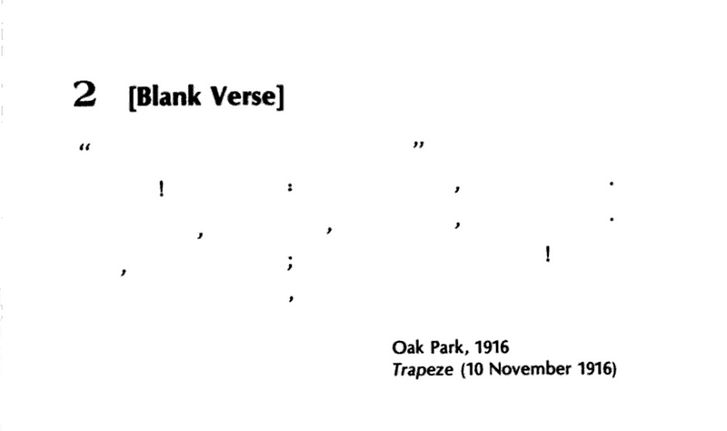
This is “Blank Verse”. It was written in 1916 by Ernest Hemingway. It started out as a school assignment but went far beyond the original intent. The piece was published later in November of that year in a humor column Air Line of a school newspaper Trapeze.
As you can see — it is a five line poem that consists only of punctuation marks divided by a certain amount of spaces to resemble some sort of a text object.
To be exact — there is a pair of quotation marks with a wide white space inside; an exclamation mark, colon, comma, dot; comma, comma, comma, dot; comma, semicolon, exclamation mark; comma. All peppered with a deliberate amount of whitespace.
It was Hemingway’s VERY literal interpretation of the eponymous literary term. While it was definitely conceived as a joke — it is more than just a frolic trifle. Even if it goes far beyond the author’s intention.
Consider the moment in which it was written. Things were obnoxiously dire in 1916. It was the year when the world was petrified in abhorrence of the World War I bloodbath. Earlier that year a group of renegade artists and writers gathered together in Zurich to declare their complete and unmitigated desperate disdain to over-sanitized, bowdlerized mess that Western Culture had turned into. Accidentally, Hemingway channeled this disdain for the old ways in his jest of a poem. Simply because he didn't gave a damn about the possible implications of his piece. He just wrote it.
Because that’s how you make cool stuff.
***
“Blank Verse” is a poem that haves fun. It is an attempt to avoid the usual pattern of thought regarding poetry. It is a dare of sorts. The poem denies the opportunity to be read, perceived and interpreted in any conceivable way.
Instead, the reader needs to acknowledge the impossibility of perceiving the poem the usual way and let it go as it is. Because it is a joke.
There is also a fruitless alternative — to try to fill in the blanks or think about the missing pieces in a given context. In a way, the poem can represent the starting point of the creative act, a plan of sorts.
But this is a mere assumption. This is not what the poem is about. As it is — “Blank Verse” is a shell of a text, a plan, a score. It can both ways — be anything and nothing in particular.
The composition gives some sort of a faux guidance. Vast white spaces in-between the punctuation marks suggest that there is a space for the text. It was left out and it can be added. The punctuation itself provides with clues of what could have been or could be.
The punctuation marks are the narrative of a poem. There are, at least, five potential sentences. Quotation marks obviously give away the title or the quote. Or it can be something described as a catalyst of a poem. Then there is something exclaimed. Possibly the nexus point of the poem. The next sentence digs into the concept. There is a possibility that it is turned around 180 degrees, then another 360 and then another 180. Afterward, there’s some sort of a aggravation with intense imagery. Recounting of features or dense, rasp of actions is also possible. At last, there’s a sentence cut in the midst of the action, possibly by means of dynamics. It is left ambiguously unfinished. And then another exclamation mark that concludes the narrative.
The last mark — coma is a sole symbol in the line and it just hangs there — as a biting reminder of the sheer impossibility of full comprehension.
***
Aesthetically — “Blank Verse” is a concrete poem, the one where visual, typographic elements prevail and dominate over the textual.
Its blankness is the point. It emphasizes the ubiquity of poetry as a concept and at the same time mocks its dubious pretense. You don’t need words to compose a poem. After all — it’s all about the composition.
And since the words tend to be interpreted in a variety of ways (sometimes way too many for the benefit and the detriment of the text) with a decent possibility of being misunderstood in varying degrees of severity — why not just leave them out of a poem? And instead — use something that can be definitely understood only as it is.
The thing is — you can’t interpret punctuation any other way than it is. Any way you look at it — it is there to perform its function and nothing more. It may be confusing in a certain context, it may be misused, but it is never something else.
And the thoroughgoing audacity of it performs an elaborately vicious extermination of a rational thought which brings this odd and misplaced notion of transcendence.
***
“Blank Verse” is what it is. It is a fascinating poem that doesn’t even need such basic elements as words to work. Its presence is imposing enough to make an impression. In the same time, it is still a throwaway joke. Just the one that goes way beyond its original intent without even trying — by mere accident.
And if you think about it, for what it is — “Blank Verse” is very effective at doing its job. It is aware of what it is and yet there is an indelible mystique to it. It is unknowable.
It is the poem that humbles the reader. It is what it is and nothing else. One can’t beat it, can’t crack it, can’t put it in a certain perspective, can’t impose own meaning to it, can’t claim any interpretation as something worthwhile or relevant to it. All the reader can do about it is to admit defeat, swallow the pride and take the poem for what it as it is.
In the same time, it is a poem that is so devoid of clues required for any sort of interpretation — it leaves a lot of space for it to thrive unanchored. It gives an additional dimension to the poem. In a way, it also needs nothing but overthinking. “Blank Verse” strives for the ironic interpretation — for all sorts of imaginary making-of, changes of context, transformations and overzealous analysis. It can bend any way imaginable and yet retain its mystique and even magnify and multiply it.
If anything — this is what real poetry is all about.
вівторок, 16 жовтня 2018 р.
Sylverster Stallone's Chaos Signature Pen and Watch
How much vanity one man can have? That's the question i was pondering for a moment or two after i have witnessed this thing. Then i felt emptiness and entitlement to tell my story.
It is a trailer for Sylvester Stallone signature pen and watch titled Montegrappa Chaos Limited Edition. It was made in 2013 by Montegrappa, an italian luxury accessory brand. And it is a beautiful piece in the most opposite manner possible.
A bit of background. In 2013 Sylvester Stallone was riding high on his successes with reviving Rocky in 2006, Rambo in 2008 and even starting a new franchise in a trilogy of Expendables movies. He also finally co-starred with Arnold Schwarzenegger in Escape Plan and even did a schlocky balls to the walls piece of pulp with Walter Hill. Finally, he was in talks with Ryan Coogler to return as Rocky in Creed. And in the middle of all this jazz he did this little shilly-shally.
The thing is, for the lack of the better world, eldritch. It is horrendous. It is ugly. It makes no sense. It is hard to understand what is the point of this whole thing and what Mr. Stallone has to do with it. In addition to that - it is also really hard to comprehend why this thing needs a trailer. Especially the one like this. It is a pen and watch presented by a celebrity - there is not much you can do in the trailer format with the stuff like that. But Mr. Stallone pulls off the impossible.
Instead of presenting a product or explaining the reason for its existence - the trailer drops bunch of stuff and summarizes it with a wham out of nowhere that barely has anything to with this pen and watch in particular or the very concepts behind these things.
This thing spawns perplexion, confusion and enbafflement. It is a rush of "huh?" and "why?" through your brain.
The trailer is narrated by Stallone which makes a bit dense verbally. The text captures Mr. Stallone musing on the nature of existence. Here's what he says, don't think too hard about it:
"To have light, there must first be darkness. Death does not exist without life. To have peace, war is required. To keep order, first there must be CHAOS.”
Chaos also happened to be the name of the pen because of course it is the name of the pen endorsed by Sylvester Stallone. It seems pretty obvious if you think about it. The design of the pen is a jumbled mess that will make your mind go blue screen of death if you try to unravel it.
After the bit of narration we get a kaleidoscope of wartorn imagery. There is computer generated skeleton lying on the ground, slowly disintegrating. There is a transitional shimmer splash and we see something resembling a monolith or a pillar or something like it. It is supposed to represent a pen. There is a skull on it because of course. Then a snake crawls from the river up the monolith-pen and sticks to it. And then there is a broadsword that is fencing on its own in the air because of course. And it all merges together in a form of a pen.
Then we get more close-ups of a computer-generated pen then human brain can processes with whooshes and swishes of transitions. It turns out that in addition to the skulls, snake and sword there is also a fist on top of it. A fist, a snake, a skull and a sword. There are words "exotic", "majestic" and "imposing" going over the images. Then there is knockout sentence: "The Power of the Written Word in Your Hands" and Mr. Stallone posing with this pen and a watch on his wrist. Look like it photoshopped there, but who knows. Maybe it really looks that unreal.
Whatever...
Here's what i feel about this thing. Sometimes you stumble upon a thing that makes so little sense any way you look at it - you just can't do anything but stuck fascinated out of morbid curiosity. That perfectly sums up this thing.
середа, 10 жовтня 2018 р.
Bil Sabab Power Hour: Sparks - When I Kiss You I can hear Charlie Parker Playing
"When I kiss you (I can hear Charlie Parker Playing)" is a song by British extraordinaries brothers Mael of Sparks. It was released in 1994 on their comeback album "Gratuitous Sax and Senseless Violins". The song itself is demented, twisted inside out backwards spin on then burgeoning genre of eurodance pop trash that was at the peak of its popularity by mid 90's.
The thing with eurodance genre is that it is so limited in its aesthetics you can't really do much with it. It is based upon a barebone templates. You have this imposing rhythm backbone upon which "verse - chorus - verse - chorus - break - chorus" structure is tacked on and it can go until the end of time and two more minutes just in case. The song closely follows its formula and in the same time it manages to subvert every single element of it and make something of its own that resembles the other thing while being fundamentally different.
The arrangement is the fascinating element of the song. It is obnoxious and gaudy. The tempo pumped up to eleven and gallops at the ridiculously breakneck speed. It brings displaced cognitive dissonance inducing cartoonish feel to the song. It blasts through.
The instrumentation contributes greatly to this uncanny notion. While being completely synthetic, the arrangement is based around typical traditional pop orchestrations - it is strings of all walks and tembres mashed together in a melted plastic something-something peppered with splashy orchestral hits. Underneath it goes by the numbers bumbling eurodance rhythm track. At times it feels as if it wandered into a song from some other placed and stuck around because he enjoyed the vibes.
The lyrics are stylized as machine gun ratatat stream of consciousness circling around desire and longing and also pitiful merciless waste of passion. The images move in jump cuts - from one thing to another.
The sequence of images slowly but surely builds a narrative out of these blocks. It paints a vivid story with very masterful fleshing out of the scene, characters and their dynamics. There is yearning, deception and treachery, despair and restlessness and abrupt shutdown of feeling.
It is really impressive how it manages to tie train of thought and the story into one knot so seamlessly. You don't even notice how much information is spelled out throughout.
"When I kiss you (I can hear Charlie Parker Playing)" is a master-class in turning things inside out make doing something special with extremely limited form eternally banished in the template purgatory.
пʼятниця, 5 жовтня 2018 р.
MFT: That time when Kyle Kallgren was impersonated by some conceptually inclined troll

Kyle Kallgren's Brows Held High is one of the most celebrated video essay series about cinema. The man knows how to uncover lots of deep stuff in various films. His videos are always insightful and full of inspired editorial choices. You can just watch the visual with no sounds and it still will retain some of the punch.
However, this story is about that time when i've stumbled upon the other channel attributed to Kyle Kallgren.
I was a big fan of his works and it was really strange to find a another channel full of nonsensical monotonous videos. And i wrote a post about it on Zouch. And then i received a comment from the real Kyle Kallgren - and it turned out that the channel was not his in the slightest - it was some "troll-impostor" as he called him.
This was a fascinating turn of events. You may wonder why anyone would take another persons name to get attention. This also may be the answer. But don't think too hard about it. Even I don't care. There's more than this.
The channel in question contained something that in certain circumstances may be considered a conceptual art of sorts. In a Martin Creed way.
It is very vile and mean-spirited kind of art. The one that can be best described by the phrase "take that". It's a collection of videos - most of them posted years ago - all of them are 15 minutes and one second long and they all have no sound and just one fixed image. In case of this post - colours. And it's wonderfully mesmerizing in its dumb simplicity.
So why it matter? Because it literally discharges the pus.
Yep. And because of that - it is good. It produces this legendary "void of blank-nil-null-any-none".
And honestly - after some disappointing bullshit and cowbell like The Tribe (the movie that was so lame and empty i thought all the substance was evacuated from its own atrocity) - looking at this is a relief.
Sure, it's more of anger management but at least these videos retain some sense of casualty. Y'know - happens. Phosphenes do their job better than one might expect. Raise a weathered thumb. The blurred mesh and murmur will drift in the gregarious smoke.
The channel has been deleted long since and you can't really experience its glorious pointlessness. But you can read my description and sleep with it. And you can also watch Jarman's Blue again...
середа, 3 жовтня 2018 р.
Accidental poetry of a game review
This is an unusual review of the newest videogame about Marvel Comics franchise player character Spiderman. It was released a couple of month on Sony Playstation 4. The review video was made by Mr. Sunday Movies and it is not your standard game review. On one hand, it is not what it is supposed to be, but on the other hand - it is more than one would expect.
Unlike any other Spiderman game reviews that flooded Youtube around the time the game was released - this one stands apart as being a thing of its own while retaining a semblance of a routine assessment commentary with a tongue firmly and tenaciously in cheek.
Part of the reason it is so lies in the very simple fact - this review blatantly omits every single trope of the traditional video game review. There are no background to speak of (except for the statement that the review copy was provided by the publisher), no technical context of the review is presented, there is no personal perspective in any manner, there are no comments regarding controls, no comments regarding the narrative structure or the pacing of the game. In a way, it gives little to no information about the game that might be helpful in the consideration process. And despite all this - it succeeds in making a lasting of what the game is about.
Instead of relying on info readalong and truism spattering - this review just lists bunch of stuff you can do in the game. There is a reason for that - an author admits he never really did a game review and has no idea how to put it together and make it stand apart from the rest. And so he does just the opposite. He makes a game review and makes distinct by not making it.
And since the game is made in the genre of a sandbox - this is probably the best way to show an audience what the game is about on a practical level.
The text of the video is something to behold. It is an unintentional piece of poetry. The that happened on accident despite lack of effort. Sometimes it happens that way, especially when the thing in question is clearly of throwaway nature. Since the text is built on the list structure - there is certain hypnotic, monotonous rhythm. It is what makes it work.
Here's a transcription in case if the video will ever go down:
Hello!
This is my review for Spiderman on a Playstation 4.
I have never reviewed a videograme before
So i'm going to list all the things you can do in the game.
Let's go.
You can run up the wall
You can climb in a vent
You can kick and kick
and web and punch and flip and kick
and jump and web and punch and kick
and kick and jump and jump on a web and then
WHOP!
You can be strangled
You can play a circuitbreaker minigame
You can play a different minigame (matching wavelengths)
You can run up a when
Then you can flip pver the building and it is beautiful sunset
And you are falling and you are falling
You think you need to grab a thing
and then you web and you go up in the air
and you do another flip
and then you are in free fall
and then you zip and you are on a little lamppost
You can have your Playstation 4 internal software catch a program glitch
so you are extremely limited by what you can show in your review
You can stealth
Look at me stealth
Dah - Knock on these boxes
You can stealth as Spiderman
and then injure a man beyond repair
You can stealth on a speeding vehicle
or die trying
You can run and run
and run and run
and run and run
and round and round
and run and run
and run and run
and run and run
and round and round
and run and run
and run and run
and round and round
and run and run
and round and round
round round...
You can swim - uh...
You can web three guys to a garbage truck and celebrate in front of them.
You can watch carrot chopping...
(awkward pause)
You can ice skate... you can't ice skate...
You can chase a pigeon
and then kill a pigeon.
And that's all the things you can do in Spiderman on Playstation 4.
понеділок, 24 вересня 2018 р.
BSPH: Louis Aragon - Suicide
Some works of art are playing on a gag reflex. However, due to ambiguousness of the verbiage, the word "gag - choke or retch" is often mixed-up with the word "gag - joke". Because "higher aspirations are about to make one his bitch". Case in point - this poem.

This is a poem by French surrealist writer Louis Aragon titled "Suicide". It was published in 1924. It is a tongue-in-cheek poem that takes two unconnected concepts and mashes them together to concoct a bout of mild cognitive dissonance.
In addition to that, "Suicide" holds a recognition of being one of the earlier examples of conceptual poetry - the one that deals more with an ideas behind the text than the text itself. In this case - it is about a reduction of language to its barest. In the same time this poem is also an affectionate parody of the utter pretentiousness that often plagues this kind of poetry.
"Suicide" is a thing of its time. It is a faux-provoking piece made purely for one's amusement - a trifle designed to annoy and perplex those who are vain enough to try to perceive its "hidden depths". In its historical context, "Suicide" is nothing more than "just another" poke at the literary conventions of then-mainstream establishment and its eerie double standards.
The poem deals with the concepts of what can be and what cannot be considered as literature. It stretches the idea far enough to make the sound of tearing heard loud and clear - because it is a funny imaginary sound. In a way, it is an elaborate "take that" to all the pretentious, overwritten, overstuffed writing and critique surrounding it locked in a perfect echo chamber of perpetual self-celebration. The irony is that the surrealist movement itself was locked in an echo chamber of its own and that was a big contributor to its subsequent downfall.
The poem itself consists of Latin alphabet recited in an alphabetical sequence broken down into five lines thus making it more or less looking like a short poem with a beginning, middle and end. However, it is a just an alphabet with a different title slapped on it. But the correlation between the title and the content is what makes it tick.
There is an intentional cognitive dissonance at play. It begs to ask "What an alphabet sequence has to do with the concept of Suicide?" only to point out that there is no actual answer to that question with any form or shade of definiteness. In fact - there is nothing to it at all. Because it is just an alphabet sequence titled "Suicide" - because why not. Technically, this is the whole point of the poem.
Ambiguousness is one of the virtues of "Suicide". It is what makes it special. Just like Hemingway's "Blank Verse", it is a throwaway joke that can be mistaken for a statement. It can be whatever a particular reader wants it to be without ever diminishing its aesthetic impact or lack of thereof.
Being the way it is - "Suicide" is so open to interpretation - there is no other way to perceive it but to transform it by comprehending it. It is just too hard to keep yourself from it. The more you look at it - the more ideas it evokes. The thing - our minds have natural tendencies towards "making sense". It is an element of a survival instinct that after generations of comforting was left to its own devices and got bored so much it jumps on every opportunity to do its thing - to make sense out of something no matter what. This poem gives mind a chance to run wild a bit only to realize at some point that sometimes there nothing to make sense of.
***
However, there is a lot to chew if we take a step in another direction and indulge ourselves in a slight bout of overthinking.
For example, "Suicide" might be interpreted as a scrabble riddle disguised as a poem. There are several words in Latin, French or English languages that contain every letter of their alphabets making a monstrous wordzillas. This notion adds another needless dimension to the poem. This way, the poem is presented in a deconstructed form, its content is reorganized in a default alphabet sequence and the goal of the reader is to put it back together - uncover the meaning behind this elaboration. There is a clue in the form of the title but that's not exactly a key.
The thing might be an easy task if you just type the query to the search engine and select the words. But since there are several options - there is a need to select the one that fits the most. Every choice gives a different shade of meaning and there is a ghost of chance to make a perfect match.
On the other hand, the process may be a futile attempt at breaking the non-existent "code" with numerous tries and fails to come up with the correct solution - by matching vowels and consonants in a semblance of coherent phonemes - all while constructing all sorts of shorter words in the process that just come and go never taken seriously.
Then there is a distinct visual rhythm in how letters f, l, r and w cap off their respective lines until the last line ends midway through. The breaks make an illusion of having distinct parts of the text - as if the sequence A-F, G-L, M-R, S-W and X-Z were some alien words, magic spells of sorts, intentionally encrypted words that can make something happen (one thing for sure, Big Bird would have liked it).
Either way, there is a narrative that actively involves readers. There is an experience beyond the text imposed by the reader itself in order to do something.
субота, 22 вересня 2018 р.
MFT: Superman Adventures #41 - "Twenty-two stories in a single bound"

"Twenty-two stories in a single bound" is a title of Issue 41 of "Superman Adventures" comic book series. The issue was written by Mark Millar and illustrated by a murderer's row of illustrators including Ty Templeton, Terry Austin, Joe Staton, Neil Vokes, Bret Blevins, Min S. Ku, Cameron Stewart, Mike Manley, Craig Rousseau, Rick Burchett, Darwyn Cooke, Aluir Amancio, Philip Bond. It was released in March 2000 and It was the last comic of Millar's run on the title.
And for a curtain call he decided to do something out of an ordinary.
The issue consists of 22 one-page stories, all self-contained and dedicated to a particular character and specific element of Superman mythos. The narrative is built around "a day in the life" format focusing on key events in their most expressive forms.
For example, there is a story about just another working week of Lois Lane. She is depicted as a damsel in distress for the majority of the panels until the script is flipped and Lois is shown to be capable of standing on her own - you know, it's just she doesn't need to do it all the time.
Or there exploits of Mister Mxysptlk who tries to ramble and scramble and bumble and rumble Superman with his reality warping powers. It doesn't go the way he expects. On the other hand, bumbling backwards Superman adversary Bizarro gets his legitimate hero moment and that is nice.
There is also a page where all the key characters are sleeping and we can see what they are dreaming about. Which is exactly what you can expect - Lois Lain being Superwoman, Jimmy Olsen being The Boss to Perry White, Bibbo (don't ask) dreaming about sleeping (of course), while Lex Luthor dreams about Superman being defeated. The page is capped with Superman doing his job. As usual.
Overall, an issue can be described as a mosaic, a kaleidoscope of moments that seems disjointed but ultimately comes together into a cohesive whole. Every story is drawn by different artist which gives them distinct indentities even though the aesthetic is largely the same.
"Twenty-two stories in a single bound" is an exercise in ultra-minimalist condensed storytelling - one-part newspaper comic strip and one-part constrained comics of the likes of Chris Ware. In a way, it is a great showcase how to tell a story in leaps and bounds that omits everything superfluous and concentrates on the key elements.
пʼятниця, 21 вересня 2018 р.
MFT: Chappelle's Show - If The Internet Was a Real Place Sketch
"If The Internet Was a Real Place" is a sketch from Chappelle's Show. It is a part of 8th episode of 2nd season of the show. The sketch is a neat kaleidoscope of all stuff going on in the early-to-mid 2000s Internet. While it is rather simplistic view of the World Wide Web it also manage to adequately depict its essense - i.e. complete and absolute mess where you rather stumble upon stuff than find something.
In the sketch, the Internet is imagined as a giant mall with all sorts of "characters" bumbing onto Chappelle. In a way, if your pareidolia skills are high - you can interpret Kevin Smith's "Mallrats" as another elaboration on this concept albeit a retroactive one. Chappelle plays a man who is on his journey though the magical space of the web for the very first time. He is a straight man who just wants to explore what it is and if there is anything worthwhile in it.
There is general sense of lack of purpose lingering upon everything.
The sketch starts with that particular feeling of being lost in the vast seemingly endless sea of web that happens the first time you get online. Without further ado, things gets weird. The first character Chappelle bumps into is personification of a fishing scam - "make your penis extra-large" kind of spam. The ensuing conversation quickly devolves into pointless attempt at persuading to spend money on a suspicious scam.
Next go free mp3 downloading sites and the whole illegal music downloads affair that was all the rage back then. There is even a cameo by then-still clumsy legal music purchase venues. Things go in a familiar direction - Chappelle grabs whole lotta stuff, most of which he will probably never even listen.
Then things move to the main event - porn. Ron Jeremy plays pornography representative who invites Chappelle to watch Paris Hilton's night vision sex tape (remember that?), which he does two times to be sure it was she for real. And then some old man in a coat and not much else invite Chappell to watch goat play with a maid in a leather uniform, which is as weird as it sounds.
After that Chappelle stumble upon a pop-ad purgatory in which he moves in a loop for a bit. Getting into a pop-up loop was something of an initiation into the Internet back in the day and seeing it play out in live-action is really-really funny.
At last there is a section with chatroom where Chappelle finally settles on a semblance of calmness in the sea of pointlessness. He even hooks up with the girl who says all the right words before it turns out to be that fishing scam guy from the beginning. It is sad sadness.
"If The Internet Was a Real Place" is a fine example of how to make highly contrasting cognitive dissonance inducing exploration of a concept while also exposing its built-in ridiculousness and not making it an infernal travesty. The key is subtlety and easygoing tone. Nothing of it really makes sense but that is the point and that is somewhat endearing.
середа, 19 вересня 2018 р.
BSPH: Steve Blackman WWF theme - Drums in the night
Sometimes a wrestling theme is going beyond establishing a character and setting to tone of the event. This is one of such examples.
"Drums in the night" was a second entrance theme for a wrestler Steve Blackman. It is dark and brooding piece that unravels a disturbing imagery. It is a chill out tribal trance composition with very dense percussion parts and tense atmospheric pads. "Drums in the night" was produced by Giles Perring and Nick Cash. The original composition was first released on an album "Rhythmworx" by the label Extreme Music. It was described as dark and dangerous drum drama.
It is also a bad example of a wrestling theme. As an entrance theme it is definitely something completely different especially for the time when it was used. However, in the same time it fails to make a statement and sonically establish a character beyond some cool and unconventional sounds. As in integral part of the wrestling character - the theme must work with the character and that is something "Drums in the night" is not really doing. Which doesn't really mean anything
Part one is more constipated looped jazz fusion stomp that is drowning in a quicksand. Part two is more of a smooth slaughterhouse in a refrigerator. Part three is the most reserved of the three. It lays the dense fog and lets the beasts out to for hunt. Curiously, nothing ever comes out of it probably because those beasts got lost in the fog but the notion of something being there is persistent.
четвер, 13 вересня 2018 р.
MFT: Predator 2 Dance Outtake
There is a new Predator movie coming out! So let us all remember this undeservedly little-known crowning moment of awesome from way back when!
This is an outtake from the film "Predator 2". It takes places on the Predator Ship that appeared during the final showdown of the Danny Glover's character Mike Harrigan and City Hunter Predator. The scene featuring the members of the Los Angeles Hunting Party. But unlike what is seen in the film, where they pick up their fallen comrade and congratulate Harrigan with getting a win - they do something out of the ordinary - a dance routine.
Yep. A bunch of predators dancing in their ship filled with some atmospheric fog because why not. Needless to say, it is quite an unconventional showcase of the species to say the least.
The scene was probably shot during one of the breaks or in the end of a tiring day or as a test of the lighting or just out of whim. It plays out as a self-contained video. If you think about it - this is an ultimate piece of behind the scenes footage. Something so out of place and so meaningless you can't resist but liking it.
The scene starts with one of the predator coming into the hall of the ship. He is then joined by the rest of gang. They get into the new jack swing groove with orchestral stabs on tails peppered with the lead predator counting down the beats. The dance is basic but given the fact that these the Predators dancing - it comes out as an utterly bizarre sight.
There is a lot of Predator hip shaking which is a bit baffling sight to behold. Then there is a little bit of tap dancing, some jumping bouncing and even a short burst of gopak before they all come into the circle and Danny Glover joins in and they get into the groove of utter ridiculuousness of the scene.
This dance was choreographed by Lionel Douglass who played one of the predators in the final scene. He is the last Predator seen dancing before Glover joins in.
"Predator 2" was a mixed bag of a film. It contained some solid Predator action, a couple of particularly nasty set-pieces, unconventional casting decisions, troubling racial stereotypes with some downright racist undertones and other somewhat erratic pace. However, it was a decent expansion of the Predator lore that culminated in a brief in-joke turning into a franchise of its own.
середа, 12 вересня 2018 р.
MFT: Wolverine Publicity

There are some things that can be considered both entirely reasonable and absurd in the same time. Case in point - Wolverine Publicity.
Wolverine was one of the biggest draws in the Marvel Comics fold back in late 80’s up to late 90’s. No wonder why - his hard boiled tough guy demeanor and badass attitude was appealing to the target audience like nothing else. He was different from the rest of the X-Men. Wolverine was enigmatic, the information about him was scattered but even a slightest glance was enough to understand that he was a real deal.
Needless to say it did wonders to the sales figures. His first solo series made a significant splash in the sales and his appearances were always an attention grabbers. Soon enough publishers took notice of this and started to exploit character’s popularity. And so Wolverine started to appear in the other Marvel titles.
This phenomenon became one of Marvel's most infamous marketing practices known as Wolverine Publicity.
On a conceptual level - there is nothing wrong with the popular character showing up in the other titles. It happens all the time, especially if the other title is just starting out and needs to establish itself or just struggling to gain momentum. Cameos of an established and popular characters in the comics are reasonable business practice. If done right, it may even help to get the other title over with the fans by proxy. If done right...
On a conceptual level - there is nothing wrong with the popular character showing up in the other titles. It happens all the time, especially if the other title is just starting out and needs to establish itself or just struggling to gain momentum. Cameos of an established and popular characters in the comics are reasonable business practice. If done right, it may even help to get the other title over with the fans by proxy. If done right...
Superman does it all the time and no one complains. But Wolverine Publicity is infamous for a reason.
At first, Wolverine’s appearances were moderately reasonably justified. He could show up because the heroes needed his help to solve a particular problem. His first X-Men appearance in Giant-size X-men was like that - the team got lost and so Xavier hired Wolverine Then there were stories were his presence was welcomed but not exactly necessary. Anyway, it was a nice touch short of being slightly overbearing. Wolverine was drawing target audiences attention and that often gave the other titles a positive sales rub.
Then things started to go out of control and the whole cameo thing started to make no sense. It was going in an increasingly random direction with Wolverine showing up, the story stopping dead so that he could pop his claws and say one of his catchphrases. And then the story went on as usual. It started to get annoying after a while but it worked.
At some point Marvel became so reckless they didn’t even bothered to put Wolverine in the stories itself instead just keeping him on the covers.
The most infamous was the one for comic book adaptation of Anita Blake series. It had Anita Blake fighting off Wolverine and that had nothing to do with the story, it was the cover-only thing. And there was a little text in the corner notifying “Wolverine does not appear in this issue”.
This phenomenon was even mocked in one of the issues of “Moon Knight” that also had Spiderman and The Punisher on the cover and the text “Wolverine does not appear in this comic” right in the middle of the cover that was continued by “But with Spiderman and The Punisher guest-starring, we have a feeling you won’t mind".
Just think about it. How reckless a publisher should be if it is so confident that people are going to buy anything with a presence of a particularly popular character even if it is a cover-only affair? Then it all came crashing down as the overall comic books sales started to wine down. With sales, constant Wolverine spotting became less and less frequent until it quietly died down.
In a way, Wolverine cameos of that era are something of a genre of its own. A kind of comic book haikus. Relentless and senseless pieces of something popping out of nowhere, making no sense and dissipating into ether.
Підписатися на:
Дописи (Atom)
-
 The Angriest Dog in the World — is a comic strip by american film director David Lynch. It is about the dog that is very-very angry becau...
 -
 The Invisible Man is a bulletproof concept. On the one hand, it is pure gimmickry. On the other hand, the set-up provides enough room to ...
 -
 I was thinking about verbless poetry recently. I saw Ezra Pound's "In the Station of the Metro" in the newsfeed and then i...